

Mets release City Connect jerseys
The uniform represents everything about and pays tribute to New York City

The long awaited release of the Mets City Connect jerseys has finally arrived with the Mets introducing the new uniform on Friday morning.
"Our new City Connect uniforms are an homage to everything that makes NYC the greatest city in the world. We wanted to honor different parts of the city that connect to our home in Queens.” said Mets Chief Marketing Officer Andy Goldberg. “From the bridges to the trains to the streets, Mets fans across New York and beyond can wear this streetwear style look with pride.”
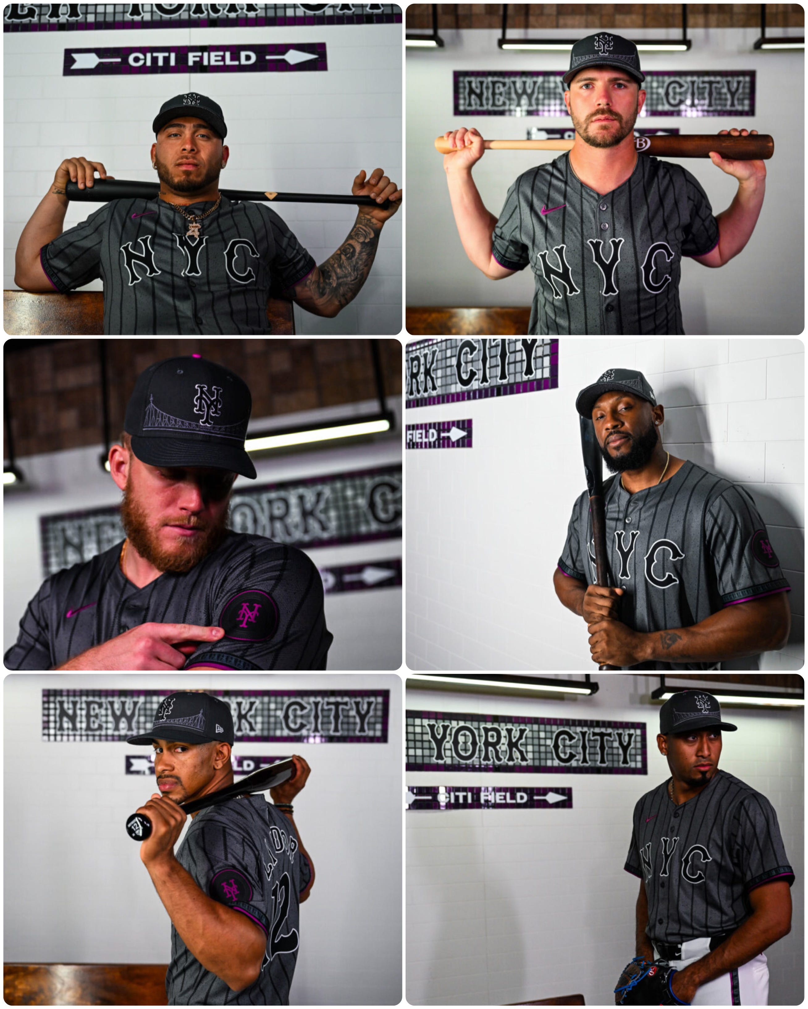
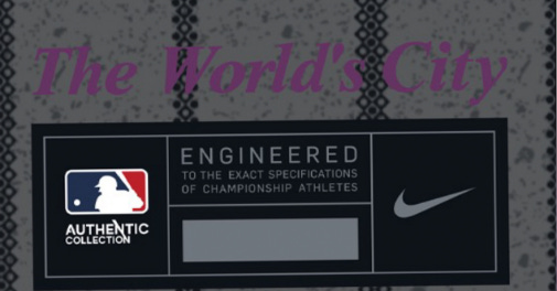
The token patch on the sleeve is a nod to the city’s past, per the team’s release, representing an old New York City subway token. There are circles and diamonds that make up the pinstripes on the jersey which represent a local and express train. The purple color theme represents The 7 Line train, and, “The World’s City” is embroidered on the bottom of the jersey, since Queens is known as the world’s borough.
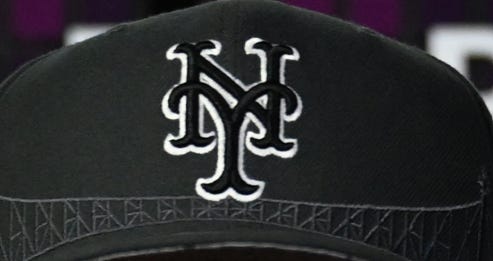
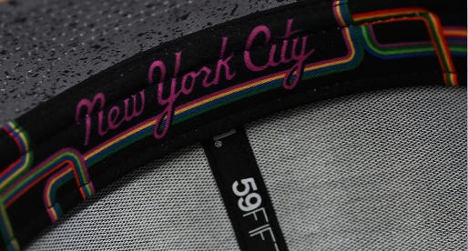
On the cap, the Queensborough Bridge is honored since that bridge is, “notably Queens,” and a print of the city’s subway map can be found on the inside of the cap.
Obviously, the Mets City Connect jersey has been met with mixed feelings, not unlike the other City Connect jerseys which have been released throughout baseball over the last few years. There are some which are better than others with a few looking a little silly for my taste. I like the Mariners, Marlins, Reds, Astros and Nationals renditions specifically, with the others simply not being for me.
I think the main issue most people have with these jerseys is they’re neither traditional nor representative of the team’s brand and history. We as fans generally being traditionalists at heart prevent us from embracing new ideas and new looks in the game. Look no further than MLB eliminating team representation during the All-Star Game and moving towards NL and AL jerseys during the game. That used to be one of the great scenes in all of baseball to me - seeing all the different team flags on one field at one time, even if it was for just three hours a year.
But these City Connect jerseys aren’t supposed to be traditional or representative of the team as much as the city the team resides in. That’s why these new Mets jerseys don’t have any blue or orange in them. When reading the design description from the team, the color schemes and underlying themes actually make perfect sense for what these uniforms are supposed to be, even if they’re not what most people want.
Look - even Howie Rose and Gary Cohen will tell you they like the simple white with pinstripes at home and grey on the road. I am a traditionalist too and believe me, uniforms matter a lot to me, perhaps too much at that. A lot of people don’t really want anything to deviate from that program. Many rejected the Snow White uniforms, they rejected the original, re-release and now re-re-release of the black uniform, and it seems we are seeing a similar rejection to these. But it’s all for the same reason we don’t like change and evolution with respect to baseball.
Why? Because when we watch, it reminds us old fogies of our youth and that imagery returns for most with each and every game we watch. For me, I identify with the 1986 Mets and love the racing stripes. But I love them because it makes me remember 1986 and Keith, Kid, Straw and Doc as Mets winning their last World Series. I wish they would bring those into circulation, but that’s probably because of my connection to that team and never ending quest to be six-years-old again.
But maybe it’s time for us to change. Yes, even us old fogies.
We may all have different stylistic tastes when it comes to uniforms. I like the 80’s racing stripes, you may like the black, another person may like the two-button style uniform from the late 1970’s. Some seem to love the new City Connect uniforms.
For me, I really like what the Mets have artistically tried to represent with these jerseys. I think they hit the nail on the head there. But I don’t love the way they look, even if I end up buying a City Connect cap and shirt.
That’s just me. I don’t think they’re bad at all. It’s just not my color and style choice.
I am attempting to separate the purpose and the style choice, offer individual opinions and embrace what is really necessary change in order to attract other segments of the marketplace, that which has potentially been alienated or simply left out by the big suits running the show at 1271 Sixth Avenue, intentionally or otherwise.
That segment being America’s youth.
I think we can all work on accepting that change has already been undertaken in this game, and what these City Connect uniforms are supposed to represent and celebrate are a part of that change. If this movement can help introduce the game and raise new interest in the game, a game which is suffering in popularity no matter what the suits would have you think, then I am totally on-board with the club’s attempt to make that “connection” to those folks.
The Mets will wear the City Connect jerseys on the following Saturday dates:
4/27 vs STL
5/11 vs ATL
5/25 vs SF
6/15 vs SD
6/29 vs. HOU
7/13 vs. COL
7/27 vs ATL
8/17 vs. MIA
9/7 vs CIN
9/21 vs PHI
Who does this City Connect paraphenalia benefit? DO the proceeds to to charity or is it just a greed grab?