

Mets introduce Martínez, and thoughts on the new black uniforms
José Quintana struggles in his latest spring start. Plus, some quick thoughts on the club's updated black jerseys.

What’s up with the Mets? 🍎
The Mets were blown out by the Astros by a score of 13-5 on Saturday afternoon (box)
LHP José Quintana struggled in his latest start, allowing five earned runs with four walks over three innings pitched
DH Mark Vientos went 1-for-2 with an RBI single in a losing effort
A trio of players in a battle to make the Opening Day roster have all struggled this spring – Luke Voit is hitting .097, Jiman Choi is hitting .189 and D.J. Stewart is hitting .171
New York formally introduced J.D. Martínez on Saturday in Port St. Lucie – Martínez told reporters he is “addicted to the playoffs”
Roster Moves 🗞️
Activated:
DH J.D. Martinez (to be optioned to AAA, min. 10 days)
Optioned to Triple-A:
RHP Shintaro Fujinami
Reassigned to minor league camp
RHP Austin Adams
DFA:
RHP Phil Bickford
Did not make team:
INF Luke Voit
C Tomas Nido
INF Jose Iglesias
Today’s Game 🗓️
GAME 1
Match-Up: Mets (14-12) vs. Nationals (15-10)
Where: Clover Park — Port Saint Lucie, FL
Starters: RHP Luis Severino (1-0, 1.00 ERA) vs. LHP Patrick Corbin (2-1, 5.11 ERA)
When: 1:10 PM EDT
Where To Watch: WPIX
GAME 2
Match-Up: Mets (14-12) at Marlins (8-12)
Where: Roger Dean Chevrolet Stadium — Jupiter, FL
Starters: RHP Tylor Megill (1-2, 3.45 ERA) vs. RHP Darren McCaughan (0-0, 8.44 ERA)
When: 1:10 PM EDT
Where To Watch: MLB.tv
Some thoughts on the updated Mets black uniforms… ✍️
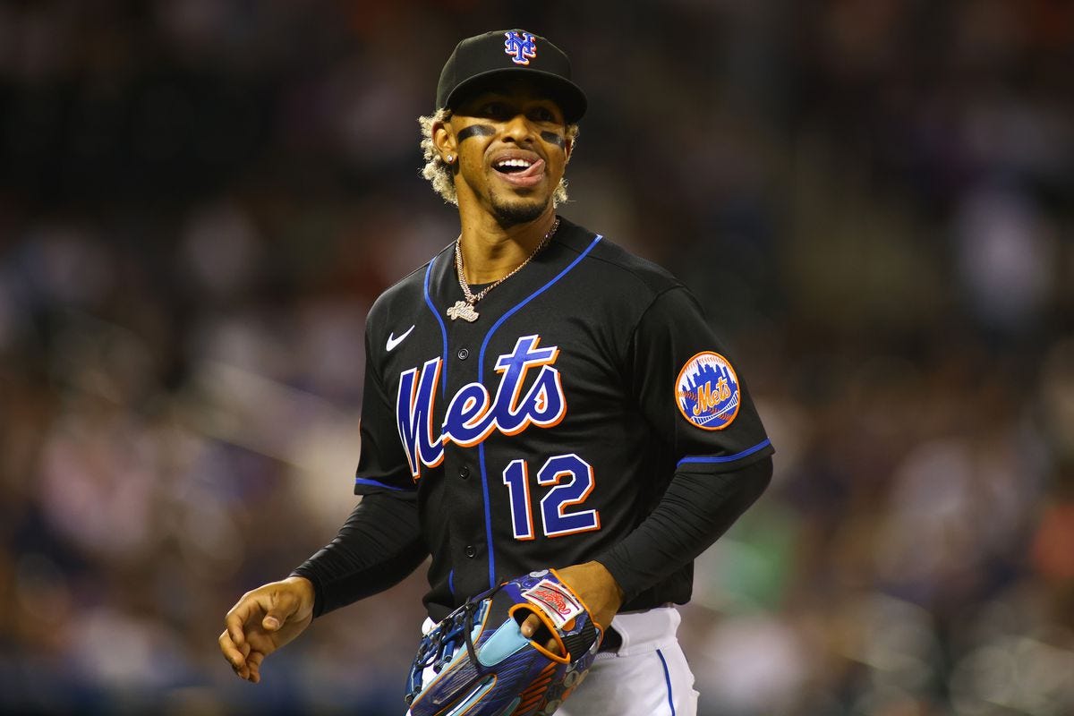
I’ve admittedly never been the biggest fan of the Mets black uniforms. Black is not a primary color of the club, and I’ve always felt strongly about how good and traditional their home white pinstripes look. So, when the organization announced in 2021 that they would be bringing their black uniforms back for Friday night home games, I was pretty hesitant.
But I must admit when I’m wrong, when I finally saw them I actually kind of liked them. There was clearly some sort of glossy, reflective material used on the lettering and numbers this time around that made those colors really pop, which made a monumental difference. And to just have them for Friday night home games did feel like a fun new tradition.
So, after initially resisting, I accepted them over time.
But then came this offseason, where it was reported that the team would be updating the black uniforms once again…
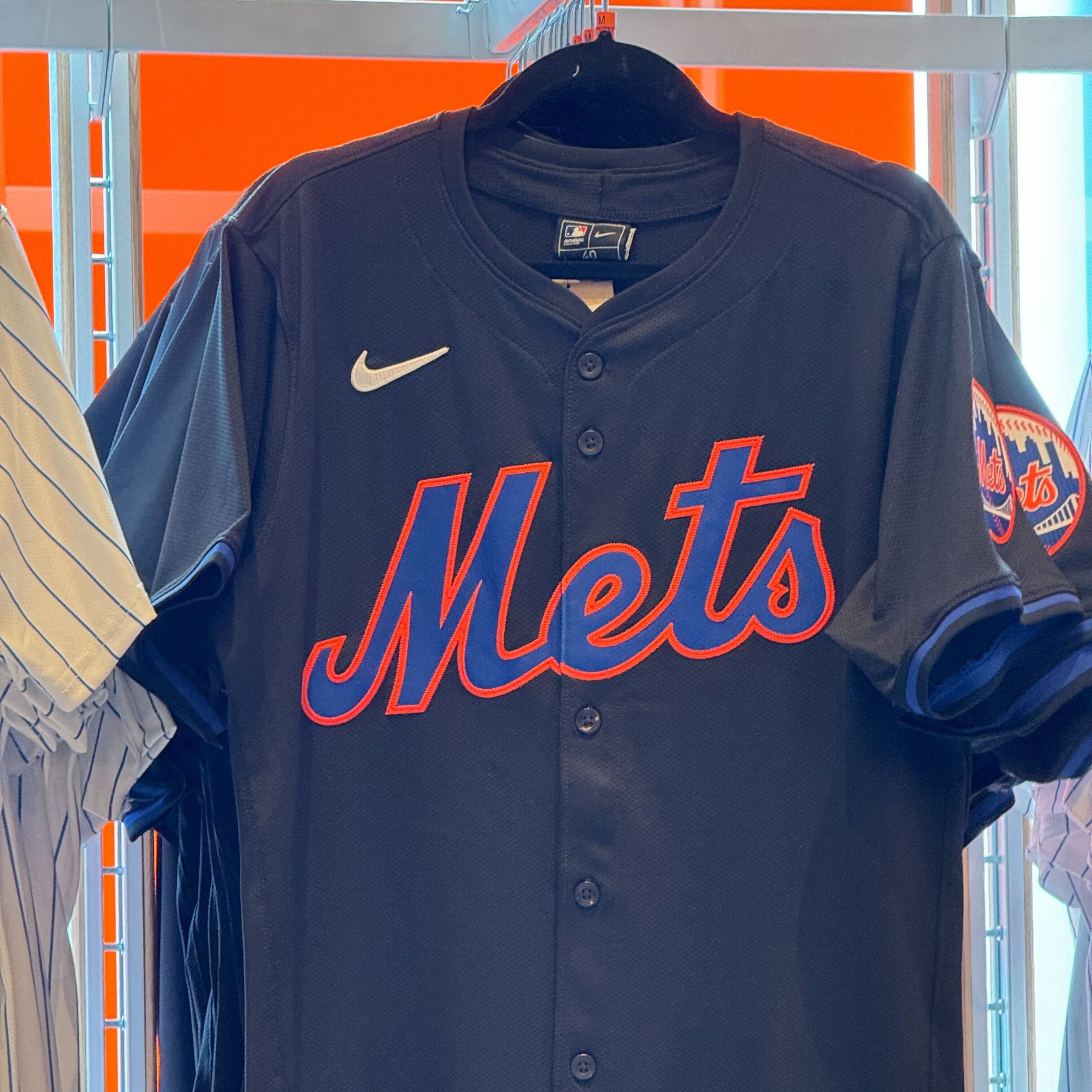
After reports from earlier in the offseason that said the team would be removing the white outline from their black jerseys and hats — a report that was an instant red flag as a design aesthetic — an image of the new jersey was leaked online over this past week.
And I’ve got to be brutally honest with you all… these look like absolute shit.
We’re all well aware of the horrifically unpopular updates to MLB’s uniforms in general with the smaller names, see-through pants and new material that makes them look worse than the knockoffs people used to hock outside of Shea Stadium. Fans have cast the blame at Nike for these decisions, while the brand has redirected the finger at Fanatics for mass producing them with cheaper materials to save costs. Regardless of who is the culprit there, you’d have to think a major upheaval will come for baseball’s uniform set once again following this season.
Those updates are clearly present in this leaked image, with the quality of the jersey material looking quite low. In the case of the Mets’ black uniforms, though, the most egregious thing is the updated design. While my day job is running a creative team in the world of advertising, you don’t need to be an expert in the field to know the poor design choices that were made here.
The white stroke on the prior set of black uniforms gave the lettering and numbers some necessary contrast and allowed those oranges and blues, the latter of which does not stand out as well over black, to appear more vibrant. Without that border doing a lot of the work, the jerseys lose a lot of what made them aesthetically pleasing in the first place.
Now the orange directly on top of the black on this material has more of a Halloween kind of feel. And even though the shade of the royal blue is the exact same as it’s always been, the combination of it being directly over the black jersey along with the removal of the glossy material they had been using since 2021 makes it appear far darker.
Combine that with the smaller names on the back and it’s likely going to be nearly impossible to identify any player from the back of their jerseys once they’re on the field. While they’re not quite as bad, it has a very similar look and feel to the Marlins black uniforms that were so widely disliked for that very reason.
Because the season is now just days away, it’s not reasonable to expect any sudden overhaul here. Like it or not, the Mets are probably going to be stuck wearing these fashion faux pas on Fridays for the next year. But if I know anything about Steve Cohen, it’s that he listens to the fans. And also… he has eyes. We can’t be sure how much he was in the process of updating these, but you’d have to believe he knows these don’t look right, either.
I’d expect the Mets will likely make the change back to something more similar to what they’d been wearing from 2021-23 at some point. But for now, get ready to watch the team play in my least favorite uniform set they’ve had in at least a decade…
Around The League 🚩
Orioles longtime owner Peter Angelos passed away at age 94
Astros 3B Alex Bregman hit a pair of three-run home runs in the club’s 13-5 victory over the Mets
Bregman told reporters that he has not received a contract extension offer from the Astros but is open to negotiating during the season (The Athletic)
Phillies RHP Taijuan Walker will undergo an MRI after being scratched from his latest start with shoulder stiffness
Everything NIKE touches, dies. The NFL has the same woes currently.
I’d object to these as a beer league softball uni…
My eyes are old and maybe I’m colorblind, but the leaked photo makes it look like the base color is a navy blue variant. Regardless, it looks like a cheap knockoff. Hard to believe MLB/Nike have screwed this up so badly. SMH 🤦♂️.